Build a Responsive UI with ConstraintLayout
ConstraintLayout allows you to create large and complex layouts with a flat view
hierarchy (no nested view groups). It's similar to RelativeLayout in that all
views are laid out according to relationships between sibling views and the parent layout, but it's
more flexible than RelativeLayout and easier to use with Android Studio's Layout
Editor.
All the power of
ConstraintLayout is available directly from the Layout Editor's
visual tools, because the layout API and the Layout Editor were specially built for each other.
So you can build your layout with ConstraintLayout entirely by drag-and-dropping
instead of editing the XML. ConstraintLayout is available in an API library that's compatible with Android
2.3 (API level 9) and higher.
This page provides a guide to building a layout with ConstraintLayout in Android
Studio 3.0 or higher. If you'd like more information about the Layout Editor itself, see the
Android Studio guide to Build a UI with
Layout Editor.
To see a variety of layouts you can create with
ConstraintLayout, check out the Constraint Layout Examples
project on GitHub.Constraints overview
To define a view's position inConstraintLayout, you must add at least one
horizontal and one vertical constraint for the view. Each constraint represents a connection or
alignment to another view, the parent layout, or an invisible guideline. Each
constraint defines the view's position along either the
vertical or horizontal axis; so each view must have a minimum of one constraint for each
axis, but often more are necessary.
When you drop a view into the Layout Editor, it stays where you leave it even if it has no constraints. However, this is only to make editing easier; if a view has no constraints when you run your layout on a device, it is drawn at position [0,0] (the top-left corner).
In figure 1, the layout looks good in the editor, but there's no vertical constraint on view C. When this layout draws on a device, view C horizontally aligns with the left and right edges of view A, but appears at the top of the screen because it has no vertical constraint.
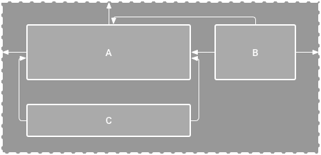
Figure 1. The editor shows view C below A, but it has no
vertical constraint
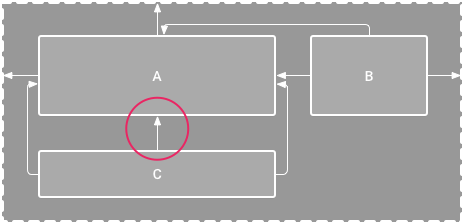
Figure 2. View C is now vertically
constrained below view A
 .
To help you avoid missing constraints, the Layout Editor can automatically add
constraints for you with the Autoconnect and infer
constraints features.
.
To help you avoid missing constraints, the Layout Editor can automatically add
constraints for you with the Autoconnect and infer
constraints features.
Add ConstraintLayout to your project
To useConstraintLayout in your project, proceed as follows:
- Ensure you have the
maven.google.comrepository declared in your module-levelbuild.gradlefile:repositories { google() }
build.gradle file,
as shown in the example below. Note that the latest version might be
different than what is shown in the example:dependencies { implementation 'com.android.support.constraint:constraint-layout:1.1.2' }
- In the toolbar or sync notification, click Sync Project with Gradle Files.
ConstraintLayout.Convert a layout
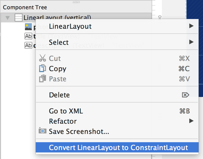
Figure 3. The menu to convert a layout to
ConstraintLayout- Open your layout in Android Studio and click the Design tab at the bottom of the editor window.
- In the Component Tree window, right-click the layout and click Convert layout to ConstraintLayout.
Create a new layout
To start a new constraint layout file, follow these steps:- In the Project window, click the module folder and then select File > New > XML > Layout XML.
- Enter a name for the layout file and enter "android.support.constraint.ConstraintLayout" for the Root Tag.
- Click Finish.
Add or remove a constraint
To add a constraint, do the following:
Video 1. The left side of a view is constrained to the left side of the parent
- Drag a view from the Palette window into the editor.
When you add a view in aConstraintLayout, it displays a bounding box with square resizing handles on each corner and circular constraint handles on each side.
- Click the view to select it.
- Do one of the following:
- Click a constraint handle and drag it to an available anchor point (the edge of another view, the edge of the layout, or a guideline).
- Click Create a connection
 in the view inspector at the top of the Attributes window.
When creating constraints, remember the following rules:
- Every view must have at least two constraints: one horizontal and one vertical.
- You can create constraints only between a constraint handle and an anchor point that share the same plane. So a vertical plane (the left and right sides) of a view can be constrained only to another vertical plane; and baselines can constrain only to other baselines.
- Each constraint handle can be used for just one constraint, but you can create multiple constraints (from different views) to the same anchor point.
Video 2. Adding a constraint that opposes an existing one
 .
.
If you add opposing constraints on a view, the constraint lines become squiggly like a spring to indicate the opposing forces, as shown in video 2. The effect is most visible when the view size is set to "fixed" or "wrap content," in which case the view is centered between the constraints. If you instead want the view to stretch its size to meet the constraints, switch the size to "match constraints"; or if you want to keep the current size but move the view so that it is not centered, adjust the constraint bias.
You can use constraints to achieve different types of layout behavior, as described in the following sections.
Parent position
Constrain the side of a view to the corresponding edge of the layout.
In figure 4, the left side of the view is connected to the left edge of the parent layout. You can define the distance from the edge with margin.
In figure 4, the left side of the view is connected to the left edge of the parent layout. You can define the distance from the edge with margin.
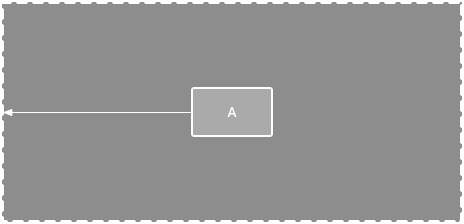
Figure 4. A horizontal constraint to the parent
Order position
Define the order of appearance for two views, either vertically or horizontally.
In figure 5, B is constrained to always be to the right of A, and C is constrained below A. However, these constraints do not imply alignment, so B can still move up and down.
In figure 5, B is constrained to always be to the right of A, and C is constrained below A. However, these constraints do not imply alignment, so B can still move up and down.
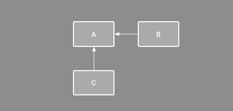
Figure 5. A horizontal and vertical constraint
Alignment
Align the edge of a view to the same edge of another view.
In figure 6, the left side of B is aligned to the left side of A. If you want to align the view centers, create a constraint on both sides.
You can offset the alignment by dragging the view inward from the constraint. For example, figure 7 shows B with a 24dp offset alignment. The offset is defined by the constrained view's margin.
You can also select all the views you want to align, and then click Align in the toolbar to select the alignment type.
In figure 6, the left side of B is aligned to the left side of A. If you want to align the view centers, create a constraint on both sides.
You can offset the alignment by dragging the view inward from the constraint. For example, figure 7 shows B with a 24dp offset alignment. The offset is defined by the constrained view's margin.
You can also select all the views you want to align, and then click Align
in the toolbar to select the alignment type.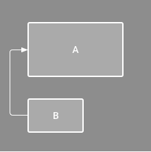
Figure 6. A horizontal alignment constraint
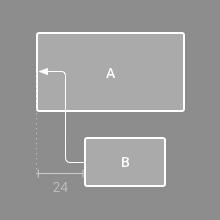
Figure 7. An offset horizontal alignment constraint
Baseline alignment
Align the text baseline of a view to the text baseline of another view.
In figure 8, the first line of B is aligned with the text in A.
To create a baseline constraint, select the text view you want to constrain and then click Edit Baseline , which appears below the view. Then click the text baseline and
drag the line to another baseline.
, which appears below the view. Then click the text baseline and
drag the line to another baseline.
In figure 8, the first line of B is aligned with the text in A.
To create a baseline constraint, select the text view you want to constrain and then click Edit Baseline
, which appears below the view. Then click the text baseline and
drag the line to another baseline.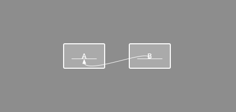
Figure 8. A baseline alignment constraint
Constrain to a guideline
You can add a vertical or horizontal guideline to which you can constrain views, and the
guideline will be invisible to app users.
You can position the guideline within the layout based on either dp
units or percent, relative to the layout's edge.
To create a guideline, click Guidelines in the toolbar, and then click either Add Vertical Guideline
or Add Horizontal Guideline.
in the toolbar, and then click either Add Vertical Guideline
or Add Horizontal Guideline.
Drag the dotted line to reposition it and click the circle at the edge of the guideline to toggle the measurement mode.
To create a guideline, click Guidelines
in the toolbar, and then click either Add Vertical Guideline
or Add Horizontal Guideline.
Drag the dotted line to reposition it and click the circle at the edge of the guideline to toggle the measurement mode.
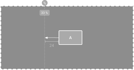
Figure 9. A view constrained to a guideline
Constrain to a barrier
Similar to a guideline, a barrier is an invisible line that you
can constrain views to. Except a barrier does not define its own position;
instead, the barrier position moves based on the position of views contained
within it. This is useful when you want to constrain a view to the
a set of views rather than to one specific view.
For example, figure 10 shows view C is constrained to the right side of a barrier. The barrier is set to the "end" (or the right side in a left-to-right layout) of both view A and view B. So the barrier moves depending on whether the right side of view A or view B is is farthest right.
To create a barrier, follow these steps:
You can also constrain views that are inside the barrier to the barrier. This way, you can ensure that all views in the barrier always align to each other, even if you don't know which view will be the longest or tallest.
You can also include a guideline inside a barrier to ensure a "minimum" position for the barrier.
For example, figure 10 shows view C is constrained to the right side of a barrier. The barrier is set to the "end" (or the right side in a left-to-right layout) of both view A and view B. So the barrier moves depending on whether the right side of view A or view B is is farthest right.
To create a barrier, follow these steps:
- Click Guidelines
in the toolbar, and then click
Add Vertical Barrier or
Add Horizontal Barrier.
- In the Component Tree window, select the views you want inside the barrier and drag them into the barrier component.
- Select the barrier from the Component Tree, open the
Attributes
 window, and then set the barrierDirection.
You can also constrain views that are inside the barrier to the barrier. This way, you can ensure that all views in the barrier always align to each other, even if you don't know which view will be the longest or tallest.
You can also include a guideline inside a barrier to ensure a "minimum" position for the barrier.
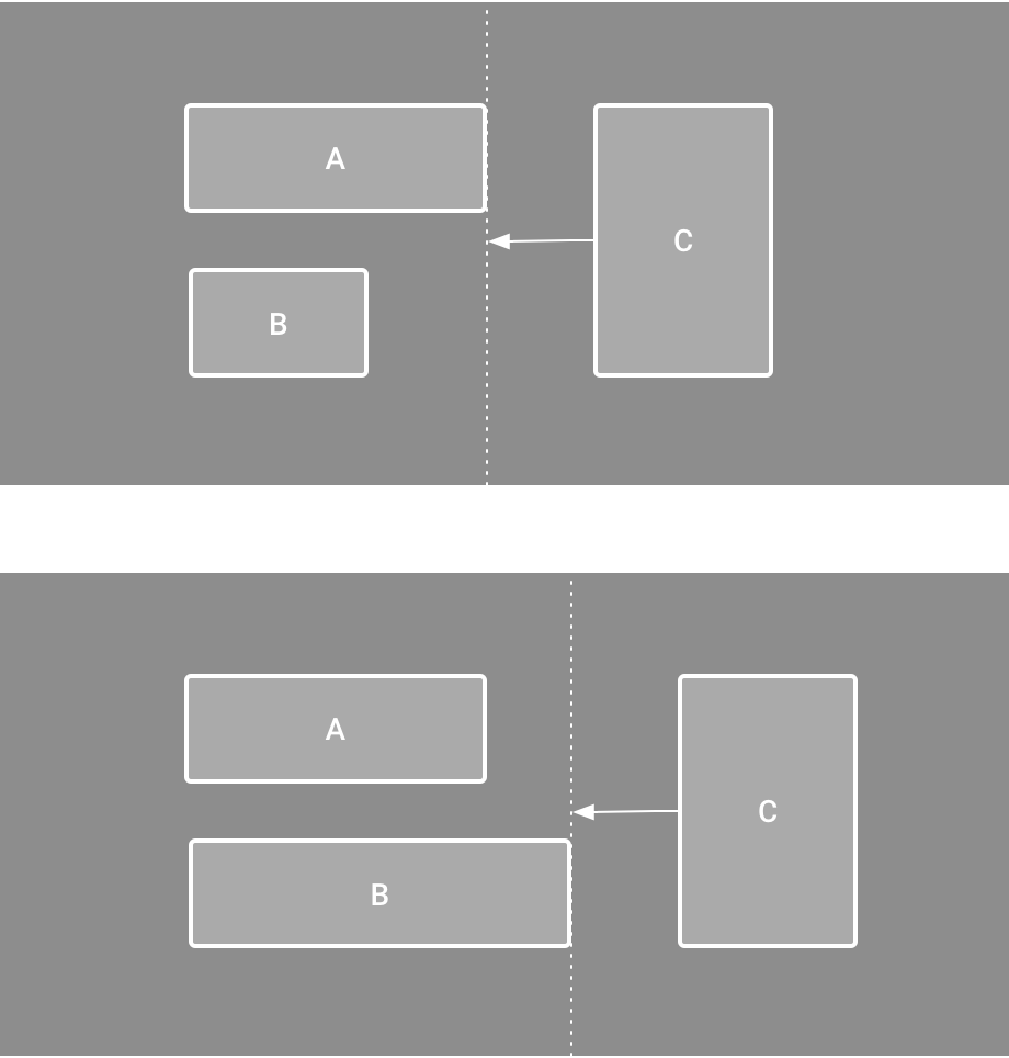
Figure 10. View C is constrained to a
barrier, which moves based on the position/size of both view A and view B
Adjust the constraint bias
When you add a constraint to both sides of a view (and the view size for the same dimension is either "fixed" or "wrap content"), the view becomes centered between the two constraints with a bias of 50% by default. You can adjust the bias by dragging the bias slider in the Attributes window or by dragging the view, as shown in video 5.If you instead want the view to stretch its size to meet the constraints, switch the size to "match constraints".
Video 5. Adjusting the constraint bias
Adjust the view size
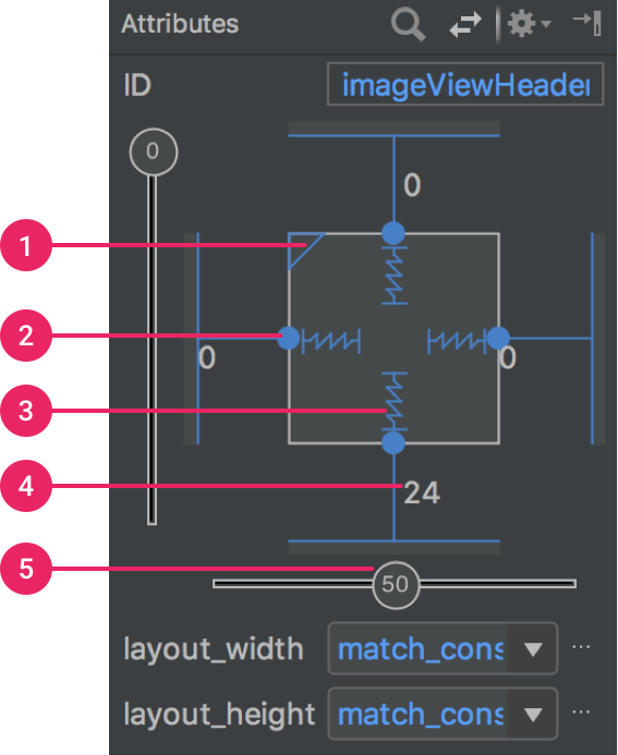
Figure 11. The Attributes window includes controls for
1 size ratio,
2 delete constraint,
3 height/width mode,
4 margins, and
5 constraint bias.
window on the right side of the editor.
Near the top of the Attributes window is the view inspector, which includes controls for several layout attributes, as shown in figure 11 (this is available only for views in a constraint layout).
You can change the way the height and width are calculated by clicking the symbols indicated with callout 3 in figure 11. These symbols represent the size mode as follows (click the symbol to toggle between these settings):
-
 Fixed: You specify a specific dimension in the text box below or by
resizing the view in the editor.
Fixed: You specify a specific dimension in the text box below or by
resizing the view in the editor. -
 Wrap Content: The view expands only as much as needed to fit
its contents.
Wrap Content: The view expands only as much as needed to fit
its contents.
-
 Match Constraints: The view expands as much as
possible to meet the constraints on each side (after accounting for the view's
margins). However, you can modify that behavior with the following attributes
and values (these attributes take effect only when you set the view width to
match constraints):
Match Constraints: The view expands as much as
possible to meet the constraints on each side (after accounting for the view's
margins). However, you can modify that behavior with the following attributes
and values (these attributes take effect only when you set the view width to
match constraints):
- layout_constraintWidth_default
- spread: Expands the view as much as possible to meet the constraints on each side. This is the default behavior.
- wrap: Expands the view only as much as needed to fit its contents, but still allows the view to be smaller than that if the constraints require it. So the difference between this and using Wrap Content (above), is that setting the width to Wrap Content forces the width to always exactly match the content width; whereas using Match Constraints with layout_constraintWidth_default set to wrap also allows the view to be smaller than the content width.
- layout_constraintWidth_min
This takes a
dpdimension for the view's minimum width.
- layout_constraintWidth_max
This takes a
dpdimension for the view's maximum width.
- layout_constraintWidth_default
Note: You cannot use
match_parent
for any view in a ConstraintLayout. Instead use "match constraints"
(0dp).
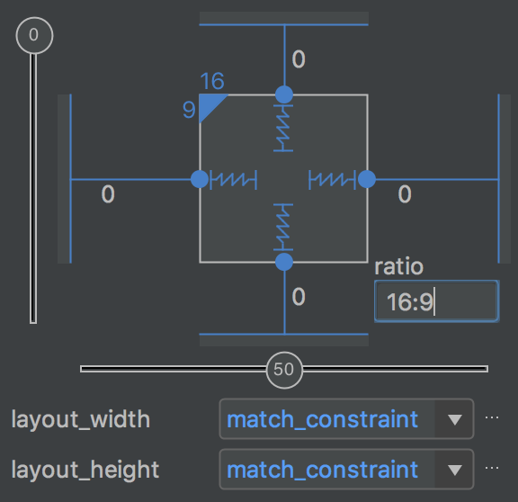
Figure 12. The view is set to a 16:9 aspect with
the width based on a ratio of the height.
Set size as a ratio
You can set the view size to a ratio such as 16:9 if at least one of the view dimensions is set to "match constraints" (0dp). To enable the ratio, click Toggle Aspect Ratio
Constraint (callout 1 in figure 11), and then enter the
width:height ratio in the input that appears.If both the width and height are set to match constraints, you can click Toggle Aspect Ratio Constraint to select which dimension is based on a ratio of the other. The view inspector indicates which is set as a ratio by connecting the corresponding edges with a solid line.
For example, if you set both sides to "match constraints", click Toggle Aspect Ratio Constraint twice to set the width be a ratio of the height. Now the entire size is dictated by the height of the view (which can be defined in any way) as shown in figure 12.
Adjust the view margins
To ensure that all your views are evenly spaced, click Margin in the toolbar
to select the default margin for each view that you add to the layout.
Any change you make to the default margin applies only to the views
you add from then on.
in the toolbar
to select the default margin for each view that you add to the layout.
Any change you make to the default margin applies only to the views
you add from then on. You can control the margin for each view in the Attributes window by clicking the number on the line that represents each constraint (in figure 11, callout 4 shows the bottom margin is set to 24dp).
Figure 13. The toolbar's Margin button.
All margins offered by the tool are factors of 8dp to help your views align to Material Design's
8dp square grid
recommendations. Control linear groups with a chain
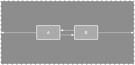
Figure 14. A horizontal chain with
two views
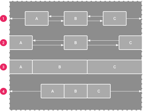
Figure 15. Examples of each chain style
- Spread: The views are evenly distributed (after margins are accounted for). This is the default.
- Spread inside: The first and last view are affixed to the constraints on each end of the chain and the rest are evenly distributed.
- Weighted: When the chain is set to either spread or spread inside,
you can fill the remaining space by setting one or more views to "match constraints"
(
0dp). By default, the space is evenly distributed between each view that's set to "match constraints," but you can assign a weight of importance to each view using thelayout_constraintHorizontal_weightandlayout_constraintVertical_weightattributes. If you're familiar withlayout_weightin a linear layout, this works the same way. So the view with the highest weight value gets the most amount of space; views that have the same weight get the same amount of space. - Packed: The views are packed together (after margins are accounted for). You can then adjust the whole chain's bias (left/right or up/down) by changing the chain's head view bias.
 that appears below the view.
To create a chain of views quickly, select them all, right-click one of the views, and then select either Center Horizontally or Center Vertically, to create either a horizontal or vertical chain, respectively. For more information, see the following video:
Video 4. Creating a chain from the action menu
- A view can be a part of both a horizontal and a vertical chain, making it easy to build flexible grid layouts.
- A chain works properly only if each end of the chain is constrained to another object on the same axis, as shown in figure 14.
- Although the orientation of a chain is either vertical or horizontal, using one does not align the views in that direction. So be sure you include other constraints to achieve the proper position for each view in the chain, such as alignment constraints.
Automatically create constraints
Instead of adding constraints to every view as you place them in the layout, you can move each view into the positions you desire, and then click Infer Constraints to
automatically create constraints.
to
automatically create constraints.Infer Constraints scans the layout to determine the most effective set of constraints for all views. It makes a best effort to constrain the views to their current positions while allowing flexibility. You might need to make some adjustments to be sure the layout responds as you intend for different screen sizes and orientations.
Autoconnect is a separate feature that is either on or off. When turned on, it automatically creates two or more constraints for each view as you add them to the layout, but only when appropriate to constrain the view to the parent layout. Autoconnect does not create constraints to other views in the layout.
Autoconnect is disabled by default. You can enable it by clicking Turn on Autoconnect
 in the Layout Editor toolbar.
Keyframe animations
ConstraintLayout, you can animate changes to the size and
position of elements by using
ConstraintSet
and
TransitionManager.A
ConstraintSet is a lightweight object that represents the
constraints, margins, and padding of all child elements within a
ConstraintLayout. When you apply a ConstraintSet to a
displayed ConstraintLayout, the layout updates the constraints of
all of its children.To build an animation using ConstraintSets, specify two layout files which act as a start and end keyframe for the animation. You can then load a
ConstraintSet from the second keyframe file and apply it to the
displayed ConstraintLayout.The code example below shows how to animate moving a single button to the bottom of the screen.
// MainActivity.kt
fun onCreate(savedInstanceState: Bundle?) {
    super.onCreate(savedInstanceState)
    setContentView(R.layout.keyframe_one)
    constraintLayout = findViewById(R.id.constraint_layout) // member variable
}
fun animateToKeyframeTwo() {
    val constraintSet = ConstraintSet()
    constraintSet.load(this, R.layout.keyframe_two)
    TransitionManager.beginDelayedTransition()
    constraintLayout.apply(constraintSet)
}
// layout/keyframe1.xml
// Keyframe 1 contains the starting position for all elements in the animation as well as final colors and text sizes
<?xml version="1.0" encoding="utf-8"?>
<android.support.constraint.ConstraintLayout xmlns:android="http://schemas.android.com/apk/res/android"
    xmlns:app="http://schemas.android.com/apk/res-auto"
    android:layout_width="match_parent"
    android:layout_height="match_parent">

    <Button
        android:id="@+id/button2"
        android:layout_width="0dp"
        android:layout_height="wrap_content"
        android:text="Button"
        app:layout_constraintEnd_toEndOf="parent"
        app:layout_constraintStart_toStartOf="parent"
        app:layout_constraintTop_toTopOf="parent" />
</android.support.constraint.ConstraintLayout>
// layout/keyframe2.xml
// Keyframe 2 contains another ConstraintLayout with the final positions
<?xml version="1.0" encoding="utf-8"?>
<android.support.constraint.ConstraintLayout xmlns:android="http://schemas.android.com/apk/res/android"
    xmlns:app="http://schemas.android.com/apk/res-auto"
    android:layout_width="match_parent"
    android:layout_height="match_parent">

    <Button
        android:id="@+id/button2"
        android:layout_width="0dp"
        android:layout_height="wrap_content"
        android:text="Button"
        app:layout_constraintEnd_toEndOf="parent"
        app:layout_constraintStart_toStartOf="parent"
        app:layout_constraintBottom_toBottomOf="parent" />
</android.support.constraint.ConstraintLayout>


Comments
Post a Comment